Why should color contrasts be clearly visible?
Color contrasts are of great importance in an accessible website. Having these contrasts helps the visually impaired and people who are color blind when visiting your website. Some color combinations are not easy to read and make reading content uncomfortable or even impossible. Did you know, 8% of men in the Netherlands are color blind?
In addition, good color contrasts ensure that search engines view your web pages as more accessible and therefore of a better standard. You can easily check this yourself in 3 easy steps.
1. Run a scan for web pages
There are several tools that help you map out your accessibility pitfalls. To check color contrasts it is best to use the Ax Scan . Once you have installed this tool, go to the page you want to scan and click on the right side of your mouse. Click here to inspect. Click at the top right on: ax DevTools and then: scan ALL of my page.

You will then get an overview of your pitfalls regarding accessibility. For now, we'll only go into color contrast. At the message " Elements must have sufficient color contrast " you can follow the next steps.
2. Improve your color contrasts
You can check contrasts via the WebAIM website. Enter an alternative color and background color here.
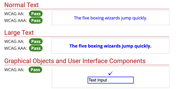
If the entered colors have sufficient contrast, the contrast checker displays these messages and you can make the changes.
3. Repeat the steps
Go through all your website pages to check the contrasts. Ultimately you will help a large part of your website visitors with these simple steps.
Do you have questions about color contrasts and making your website accessible?
- Check out our HubSpot CMS page
- Or contact us and ask your question