The road to an accessible website: Texts
Writing texts is one of the most important tasks of a marketing team, but does your marketing team know how to do this for people with disabilities? In this series we take you on your way to an accessible website. In part one of the series, I will give you 8 tips so that you and your team can create texts for everyone!
Are you curious how you can optimize your entire website? Please check: Make your website accessible? That's how you do that!
1. Provide a clear structure
You can achieve a clear structure on your website by simply adding headings to your text. Always make sure the headings end with one, in other words don't go from h1 to h3. In addition, you only use one h1 per page and ensure your headings are descriptive.
Keep your texts concise by using lists and writing short paragraphs. Everyone likes to read well-structured website text!
Be sure that your content is displayed in a logical way. Furthermore, make sure that the screen reader reads your content correctly.
2. Make use of clear links
Use descriptive links. Make sure the links describe where they lead. For example not: Click here, but: Read about us here .
It is best practice to use a line under text to indicate a link. People who are color blind sometimes don't see the difference between link and text. If you still want to use only one color, be sure to ask people who are color blind for their opinion and experiences.
Other tips are:
- avoid raw URLs (such as https://website.com/page), because screen readers read it out loud to users, no matter how long it is;
- use meaningful keywords in your link;
- avoid unnecessary extra words and stay concise;
- avoid additional links leading to the same destination.
3. Make your text scalable
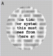
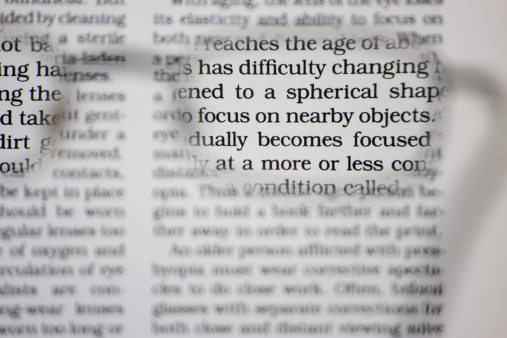
The style preferences of a text are different for everyone.
4. Write accessible texts
Another influence of a readable text is how you write it, here's a summary of what to do:
- don't use difficult words and jargon;
- give a synonym or additional explanation for difficult words;
- stay consistent with your words;
- avoid passive sentences with words like: be, will, have, etc;
- avoid imagery, many people find that difficult to understand.
5. Give your text the right color
Statistics have shown that 8% of men in the Netherlands are color blind, so you don't want to exclude such a large group. Therefore, carefully check the color contrasts of your text.
You can check the contrasts of your website via the WebAIM website. Enter an alternative color and background color here.
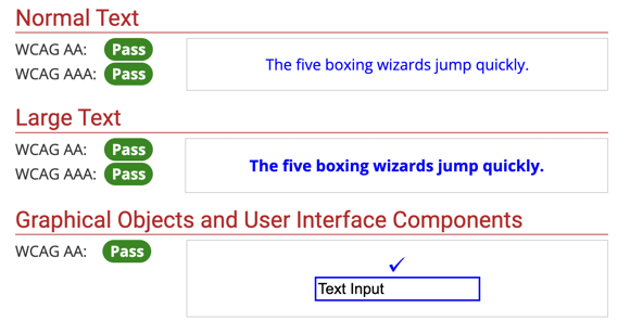
If your entered colors have sufficient contrast, the contrast checker will display the above messages and you can make the changes.
6. Tips for the website styling
- line height (line spacing) to at least 1.5 times the font size;
- space after paragraphs to at least 2 times the font size;
- spacing (space between letters) to at least 0.12 times the font size;
- word spacing to at least 0.16 times the font size.
The main thing here is that well begun is half done. When designing your website, check whether the text is legible. Then take a step back and see if your text is still legible.
7. Button left
Similar to links, buttons should have descriptive text. For instance, screen readers can read out what the purpose of the link is. If the button is just an icon, add an aria label or title in the html. You can do this using HubSpot by:
1. In your rich text module, right above, click Advanced > Source code.
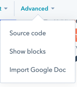
2. Add a title or aria label here.
<a href="/blog/make-your-website-accessible-so-you-do-that" title="read a blog about accessibility here" > ➡️</a>
<a href="/blog/make-your-website-accessible-so-you-do-that" aria-label="read a blog about accessibility here" > ➡️</a>
8. Button style
Buttons are usually put in place to stand out, so color contrast is also an important aspect to consider here. Repeat step 5 with your buttons to check if your buttons have sufficient contrast.
In addition, make sure that the surface of your buttons is large enough. Some people find it difficult to click on a small area. You wouldn't want someone to not be able to send a contact form.
Do you want to know more about accessibility? We are happy to help you improve your website. Contact us and let us know what we can do for you.
Share this
You may also like
The road to an accessible website: Multimedia

The way to an accessible website: Operated via keyboard


