.svg "ConversionCrew_color (1)")
.svg "ConversionCrew_white (1)")
Forms are indispensable. It is the moment when your website visitor can become a lead. However, not everyone can fill in a contact form.
In this blog I tell you the success criteria of a form, based on WCAG 2.1 level A. This blog is part of a series. In part one I teach you everything about accessible website texts and in part two you learn everything about accessible multimedia.
1. Non-text content (CAPTCHA)
All non-text content needs a text alternative. Think of these, images, icons, buttons and animations. Provide aria tags and alt tags with a clear and concise description. An exception is an image that is only there for decoration, in this event leave the alt tag empty.
Note, if you use CAPTCHA, ensure you have a version where you are not dependent on images. Blind and partially sighted people will be unable to submit the form.
2. Don't just use color for notifications
Never rely solely on shape, color, size, visual location, orientation, or sound. A common mistake with forms is a color-only error message. People who are color blind won't know what they have entered incorrectly.
The solution is to indicate which plane is wrong with both color and text. It is best practice to indicate what the error is. For instance, E-mail must be formatted correctly.
3. Make timing customizable
If you have not set a time limit on your forms, you can skip this criteria. If you have implemented time limits, make sure you have one of the following options:
- Disable: The user can disable the time limit.
- Adjust: The user can adjust the time limit to at least ten times as long as the default setting.
- Extend: The user will be warned 20 sec before the limit has expired. The user can extend this limit at least ten times with a simple action.
Exceptions:
- Event: Timed events such as auctions are exceptions.
- Critical exception: A time limit is essential if extending it would invalidate an action.
- 20 hours: If a time limit is longer than 20 hours, the form does not have to comply with the above rules.
4. Descriptive Headings and Labels (2.4.6)
Descriptive headlines quickly clarify what is expected of the user. Headings don't have to be long. One word or an icon can sometimes be enough.
Before you put your form live, ask a colleague or other person if it is clear what is expected of them. Are there any doubts? Then change the headlines.
5. Operable via keyboard (2.4.7 and 3.2.1 )
Make sure your form is operable via your keyboard. Test this by pressing tab and see if there is a line in the places where something needs to be entered. This outline is called a focus element. If you don't have this, it's best to work with a developer to implement one.
Tip for the design of a focus element, don't depend only on color, make sure you have an outline and not just text that changes color.
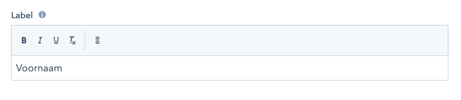
6. Labels(3.3.1)
Labels, like headlines, make clear what is expected of the user. The following also applies to labels, remember short but sweet!
Labels are sometimes overlooked resulting in issues, as screen readers read the labels of a form. Therefore, users who rely on a screen reader also know what is expected of them. You can easily adjust these labels via the HubSpot forms.
 Indicate which fields are mandatory, so the user is not faced with surprises.
Need help? We are happy to help you with your accessible website. Contact us for more information.

Share this

The way to an accessible website: Operated via keyboard
The road to an accessible website: Texts